Wednesday, December 26, 2012

Day 4 - An animal you think is really cute

I rushed through this one a bit too, but for rushing, it took a little too long :P

I like elephants.


Day 3 - Friends

This one didn't turn out as cute as I wanted it to because I rushed through the paint job (because I'm behind...). My friends did really cute drawings for this one, so I wanted to make mine match... I'll touch it up if I have extra time later. For halloween, my friends and I were the Power Puff Girls and Professor Utonium, so I drew us as the characters we dressed up as.


Tuesday, December 25, 2012

Day 2 - Someone You Like (celebrity/significant other/crush)

Yes, I'm aware this is a few days late, hush.

I don't have a celebrity, crush or a significant other I wanted to draw/paint, so I decided to go with characters I like. I couldn't decide between the three, so I mashed up Professor Layton with Phoenix Wright and Link. But really, it's just the professor, and he's standing behind the defense bench holding the Master Sword... I TRIED, OKAY?!?! -__-


I meant to add Navi in, but I forgot and I'm tired. It wasn't supposed to be this finished. I meant to do a quick and sloppy job so I could catch up, but then I rendered something in the background, so I had to attempt to render everything else....

P.S.: Merry Christmas, everyone :)

Saturday, December 22, 2012

Day 1 - Persona

I'm going to try to do a 30 day drawing challenge with my friends :) I hope I can keep up! I'm already a day behind!

Here is Day 1: Persona


This took me way to long. I stayed up all night working on this. Now I'm gonna go get lunch. :)

Monday, December 17, 2012

Intro to 3D Animation: Final Demo Reel

This semester, I was enrolled in a class for beginning 3D animation. This class has been an interesting journey for me. After taking beginning 2D animation in my first year, I was convinced I was not an animator. I hated animating in 2D and I was so much better at rendering illustrations. When I took the 3D modeling class last year,  I found that I didn't enjoy that class either. So when I came to this class, I expected hell: animation AND working in 3D....

However, I was definitely caught off guard when I discovered that I thoroughly enjoyed this class. Up until now, I thought I was 100% sure I was going into illustration. After taking this class, I'm seriously considering going into 3D animation. Things are still in the air since 3D animation is still very new to me. I think time will tell whether I truly enjoy this style of animation.

Here is my final demo reel of the big assignments we did this semester. Enjoy!


*edit*
Sorry the audio for the personality walk doesn't work. I don't know why it's doing that...

Tuesday, November 27, 2012

A few sketches...

Here were a few sketches I did last month that I actually kind of like. As always, there are things I don't like about them, but these three sketches have proven to me that I actually have improved.

JC all bundled up. She's probably on tumblr... Or browsing through Dance Central things...

Panda! Inspired by the shapes of some water drops on JC's apartment sink.

I don't drink coffee, but I hear this place is all the rage (that sounded sarcastic, but it wasn't).


Also, I PASSED THE PORTFOLIO REVIEW!! :D Totally didn't think I'd pass!
These sketches make me kind of excited for my winter sketchbook because they tell me I've gotten better (despite what my self esteem tells me).

Okay, back to homework now.

Monday, November 26, 2012

Productivity = Good

For one night's work, I'm pretty satisfied :)

Simple lighting for a 3D scene:


Value Study (stage 1)

Value Study (stage 8)

Almost done with the value study. Then on to color comps!

Goodnight! :)

Tuesday, November 6, 2012

Portfolio Review: Round 2

Well... Here it is. What's done is done. Now I wait and hope!


 Charcoal Reversal


 Short Poses


Medium Length Poses


Anatomy Studies


113A Painting


113B Renderings


113B Tree Studies

Thursday, October 25, 2012

It's Portfolio Time Again!

Here are some new things I'm thinking about putting into my new portfolio. Classwork stuff is mostly going to stay the same because I have to put them in, but hopefully the addition of my 113B stuff will help move my portfolio from "no" to "yes." There are some things that I have yet to scan in, but this is the new stuff I have so far.

Note: This is not my actual layout. They're just things I want to put in. They'll be arranged in a layout later.

I took Robin's design from Teen Titans and I made him older. I don't know if it would be good to put fanart into a portfolio, but I liked how he looked (minus his elbow areas). I might just end up taking him out.


An original character I made this summer. She's the first character I've made that I actually put into Photoshop and tried to make her look nice.


I mostly like this one for the arm and torso. I know the legs are weird, but I can either try and fix it, or I can just take out this one.


Pinecone (Graphite Rendering)


 Pinecone (Acrylic Paint Rendering)


Peruvian Pepper Tree Berries (Graphite Rendering)


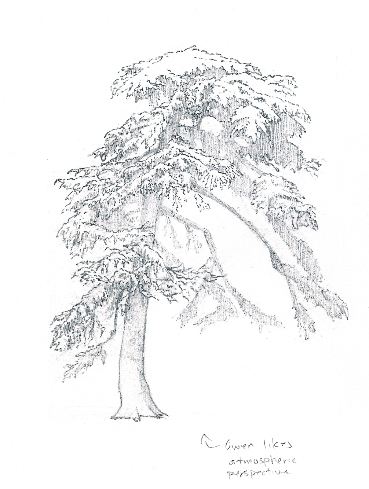
Some tree in front of the library at school (ignore the notes I forgot to erase)


Another tree in front of the library.

Edit: Look at some of these again, I realize how bad the scans are. The trees and the berries don't look very good here.

Wednesday, August 1, 2012

Figure Drawing

Well, it's past midnight, but to me, it's still Tuesday.

So on Tuesdays, we have summer figure drawing. I got home, but I still wanted to draw, so I pulled up a figure drawing website with anatomy. I kinda liked what I drew. I threw a piece of tracing paper on top to clean it up a bit, but without all the under-drawing, it seemed to be missing the feeling I put into it...

Here's the one with the first drawing under it. It feels like it has more weight to it:


Here's the one with just the tracing paper. The lines feel so flimsy compared to the first one:


Well, anyway, I kinda liked it, so I decided to post it.

Also, I liked the face on it. It actually makes some sense.

**edit**
The hands and feet look really strange, especially the feet.... I've never had the feet look worse than the hands before.... But the model had weird feet... I'm used to drawing skinnier feet, and these feet were pretty big... I guess I should work on drawing thicker feet then.

Monday, July 30, 2012

Word a Week Illustration #3: Supervillain


Meet Tanya Victera.

I had her whole back story typed up, but it's pretty darn long, so I decided not to post it. I might post it another time, but for now, here's a sort of summary:

A child prodigy, she quickly mastered several forms of martial arts and is quite the marksman with firearms at the young age of nine. She's not a super villain, but she suffered a traumatic childhood and she is out to set the world on fire and watch it burn.


Yep... Looking at it now, there are some changes that need to be made, but overall, I don't think I'm very disappointed. Maybe just a little :P

Monday, July 23, 2012

Word a Week Illustration #2: Superhero

Last week's word was Superhero. I know Robin's not a real superhero, but I like him. Plus, two of my friends and I just finished watching the Teen Titans series, so we decided to spam others with Teen Titans characters :)

My friends did Beast Boy and Starfire. I was the only one who did mine in a Teen Titans style though. Beast Boy was very, very awesomely painted, and Starfire was done in the comic version, not Teen Titans version. For me, I just made Robin look a little older, and I used Teen Titan model sheets for my reference.


Again, I wish I had made a real background. I cheated and used a photo because I was already 3 hours late with my illustration. Had I painted one myself, I might have not been able to finish until the next day. Still, I'm happy with the way it turned out. I'm thinking I might paint a background for it to really make it my own.

Thanks to whoever's picture I stole for the background! :P

Word a Week Illustration #1: Turtle

We're doing Word a Week Illustration again! But this year, instead of having one person choose each week's word, we're tossing out themes and then voting on them.

Week 1's word was turtle. Here's my illustration:


Baby turtle really wanted that star, so he got some big friends to help him out :)

I wish I had added some sort of background instead of having it just plain black. I did this at a friend's house and I had left my tablet at home, so with what I had in my pen pouch, I made this in a half hour. If I had a tablet, I probably would have taken about 3 hours on this. 5 hours if I added a background.

Portfolio Review Attempt #1

This is the portfolio I submitted this past semester. I didn't get in, and I think I know why. I definitely need to work harder and improve before I apply again in the fall.

Cover Page:

112A Charcoal Reversal: Palazzo Ducale

112A Pen & Ink Illustration: "The Glove"

113A Black & White Acrylic Painting and Color Comps: Insomnia

112B Figure Drawings: Short Poses

112B Figure Drawings: Long Poses

Anatomy Studies

Drapery and Perspective

Sketchbook

Sketchbook

Wednesday, July 4, 2012

Monday, July 2, 2012

Speed Painting #15

Here's a rooster thing!
Photo:


Painting:

I cropped the photo because there was too much background and it was kind of boring since there's no middle ground or anything on the right side.

Feathers are frickin' hard. I also didn't squint enough again. I find that if I'm better rested, I squint better. Actually, when I'm better rested, I remember to squint, which I guess qualifies as squinting better since I don't squint at all when I'm tired....

Not very fond of this painting. The colors suck and the shapes suck. I still need to go darker. Some parts need to be more saturated too. Fuuuuuuuuu--------

Sunday, July 1, 2012

Speed Painting #14

Well... Here's a sinking ship...
Photo:

Painting:

The stupid type on the ship is awful. I tried to write it in quickly and get back to it later to paint the shapes instead of writing it, but I didn't get to it. A lot of my values are wrong too.

I know I still have 2 left, but I think this will be my last one. I'm really tired and I don't think I'll learn much more if I keep going. It was really hard for me to find my shapes on this one, and this one was supposed to be easier. It's only going to get worse if I keep painting.

A consistent thing in all four paintings is that I'm afraid to go dark. The darkest parts of my painting are never dark enough.

I like these painting days. I need more of these :)

Saturday, June 30, 2012

Speed Painting #13

This is a picture of Liberia, Costa Rica:

Here's the painting:

After blocking in the shapes, I wanted to start over because everything was wrong. I didn't squint at all. Once I squinted, I saw that everything was off. I didn't start over though, because my friends and I are working as a group and I didn't want them to wait 15 minutes for me (we were sharing a timer). So I made do with what I had, and I feel like my painting suffered since I was trying to constantly correct my mistakes from my blocking stage.

Three down, three more to go.